Representing Data Graphically
Learning Objectives
- Create a frequency table, bar graph, pareto chart, pictogram, or a pie chart to represent a data set
- Identify features of ineffective representations of data
- Create a histogram, pie chart, or frequency polygon that represents numerical data
- Create a graph that compares two quantities
In this lesson we will present some of the most common ways data is represented graphically. W e will also discuss some of the ways you can increase the accuracy and effectiveness of graphs of data that you create.
Presenting Categorical Data Graphically
Visualizing Data
Categorical, or qualitative, data are pieces of information that allow us to classify the objects under investigation into various categories. We usually begin working with categorical data by summarizing the data into a frequency table.
Frequency Table
A frequency table is a table with two columns. One column lists the categories, and another for the frequencies with which the items in the categories occur (how many items fit into each category).
Example
An insurance company determines vehicle insurance premiums based on known risk factors. If a person is considered a higher risk, their premiums will be higher. One potential factor is the color of your car. The insurance company believes that people with some color cars are more likely to get in accidents. To research this, they examine police reports for recent total-loss collisions. The data is summarized in the frequency table below.
| Color |
Frequency |
| Blue |
25 |
| Green |
52 |
| Red |
41 |
| White |
36 |
| Black |
39 |
| Grey |
23 |
Try it now
Don’t get fancy with graphs! People sometimes add features to graphs that don’t help to convey their information. For example, 3-dimensional bar charts like the one shown below are usually not as effective as their two-dimensional counterparts.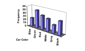 Here is another way that fanciness can lead to trouble. Instead of plain bars, it is tempting to substitute meaningful images. This type of graph is called a pictogram.
Pictogram
A pictogram is a statistical graphic in which the size of the picture is intended to represent the frequencies or size of the values being represented.
example

A labor union might produce the graph to the right to show the difference between the average manager salary and the average worker salary.
Looking at the picture, it would be reasonable to guess that the manager salaries is 4 times as large as the worker salaries – the area of the bag looks about 4 times as large. However, the manager salaries are in fact only twice as large as worker salaries, which were reflected in the picture by making the manager bag twice as tall.
This video reviews the two examples of ineffective data representation in more detail.
https://youtu.be/bFwTZNGNLKs
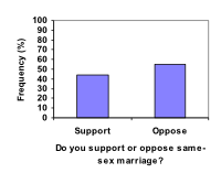
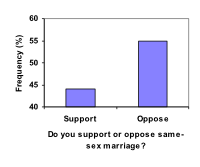
Another distortion in bar charts results from setting the baseline to a value other than zero. The baseline is the bottom of the vertical axis, representing the least number of cases that could have occurred in a category. Normally, this number should be zero.
example
Compare the two graphs below showing support for same-sex marriage rights from a poll taken in December 2008[footnote]CNN/Opinion Research Corporation Poll. Dec 19-21, 2008, from
http://www.pollingreport.com/civil.htm[/footnote]. The difference in the vertical scale on the first graph suggests a different story than the true differences in percentages; the second graph makes it look like twice as many people oppose marriage rights as support it.
Try It Now
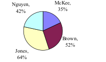
A poll was taken asking people if they agreed with the positions of the 4 candidates for a county office. Does the pie chart present a good representation of this data? Explain.
Presenting Quantitative Data Graphically
Visualizing Numbers
 Quantitative, or numerical, data can also be summarized into frequency tables.
Example
A teacher records scores on a 20-point quiz for the 30 students in his class. The scores are:
19 20 18 18 17 18 19 17 20 18 20 16 20 15 17 12 18 19 18 19 17 20 18 16 15 18 20 5 0 0
These scores could be summarized into a frequency table by grouping like values:
| Score |
Frequency |
| 0 |
2 |
| 5 |
1 |
| 12 |
1 |
| 15 |
2 |
| 16 |
2 |
| 17 |
4 |
| 18 |
8 |
| 19 |
4 |
| 20 |
6 |
Using the table from the first example, it would be possible to create a standard bar chart from this summary, like we did for categorical data:
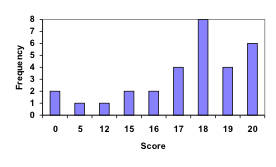
However, since the scores are numerical values, this chart doesn’t really make sense; the first and second bars are five values apart, while the later bars are only one value apart. It would be more correct to treat the horizontal axis as a number line. This type of graph is called a
histogram.
Histogram
A histogram is like a bar graph, but where the horizontal axis is a number line.
example
For the values above, a histogram would look like:
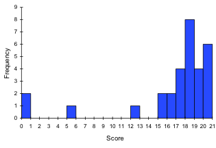
Notice that in the histogram, a bar represents values on the horizontal axis from that on the left hand-side of the bar up to, but not including, the value on the right hand side of the bar. Some people choose to have bars start at ½ values to avoid this ambiguity.
This video demonstrates the creation of the histogram from this data.
https://youtu.be/180FgZ_cTrE
Unfortunately, not a lot of common software packages can correctly graph a histogram. About the best you can do in Excel or Word is a bar graph with no gap between the bars and spacing added to simulate a numerical horizontal axis.
If we have a large number of widely varying data values, creating a frequency table that lists every possible value as a category would lead to an exceptionally long frequency table, and probably would not reveal any patterns. For this reason, it is common with quantitative data to group data into class intervals.
Class Intervals
Class intervals are groupings of the data. In general, we define class intervals so that
- each interval is equal in size. For example, if the first class contains values from 120-129, the second class should include values from 130-139.
- we have somewhere between 5 and 20 classes, typically, depending upon the number of data we’re working with.
example
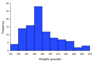
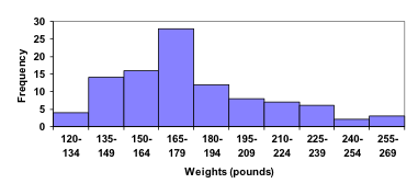
Suppose that we have collected weights from 100 male subjects as part of a nutrition study. For our weight data, we have values ranging from a low of 121 pounds to a high of 263 pounds, giving a total span of 263-121 = 142. We could create 7 intervals with a width of around 20, 14 intervals with a width of around 10, or somewhere in between. Often time we have to experiment with a few possibilities to find something that represents the data well. Let us try using an interval width of 15. We could start at 121, or at 120 since it is a nice round number.
| Interval |
Frequency |
| 120 - 134 |
4 |
| 135 – 149 |
14 |
| 150 – 164 |
16 |
| 165 – 179 |
28 |
| 180 – 194 |
12 |
| 195 – 209 |
8 |
| 210 – 224 |
7 |
| 225 – 239 |
6 |
| 240 – 254 |
2 |
| 255 - 269 |
3 |
A histogram of this data would look like:
In many software packages, you can create a graph similar to a histogram by putting the class intervals as the labels on a bar chart.
The following video walks through this example in more detail.
https://youtu.be/JhshitTtdP0
Try it now
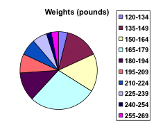
Other graph types such as pie charts are possible for quantitative data. The usefulness of different graph types will vary depending upon the number of intervals and the type of data being represented. For example, a pie chart of our weight data is difficult to read because of the quantity of intervals we used.
 To see more about why a pie chart isn't useful in this case, watch the following.
https://youtu.be/FQ8zmZ56-XA
To see more about why a pie chart isn't useful in this case, watch the following.
https://youtu.be/FQ8zmZ56-XA
Try It Now
The total cost of textbooks for the term was collected from 36 students. Create a histogram for this data.
$140 $160 $160 $165 $180 $220 $235 $240 $250 $260 $280 $285
$285 $285 $290 $300 $300 $305 $310 $310 $315 $315 $320 $320
$330 $340 $345 $350 $355 $360 $360 $380 $395 $420 $460 $460
When collecting data to compare two groups, it is desirable to create a graph that compares quantities.
Example
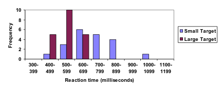
The data below came from a task in which the goal is to move a computer mouse to a target on the screen as fast as possible. On 20 of the trials, the target was a small rectangle; on the other 20, the target was a large rectangle. Time to reach the target was recorded on each trial.
| Interval (milliseconds) |
Frequency
small target |
Frequency
large target |
| 300-399 |
0 |
0 |
| 400-499 |
1 |
5 |
| 500-599 |
3 |
10 |
| 600-699 |
6 |
5 |
| 700-799 |
5 |
0 |
| 800-899 |
4 |
0 |
| 900-999 |
0 |
0 |
| 1000-1099 |
1 |
0 |
| 1100-1199 |
0 |
0 |
One option to represent this data would be a comparative histogram or bar chart, in which bars for the small target group and large target group are placed next to each other.
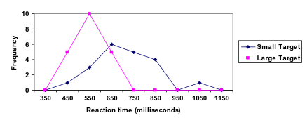
Frequency polygon
An alternative representation is a frequency polygon. A frequency polygon starts out like a histogram, but instead of drawing a bar, a point is placed in the midpoint of each interval at height equal to the frequency. Typically the points are connected with straight lines to emphasize the distribution of the data.
example
This graph makes it easier to see that reaction times were generally shorter for the larger target, and that the reaction times for the smaller target were more spread out.
The following video explains frequency polygon creation for this example.
https://youtu.be/rxByzA9MFFY
Licenses & Attributions
CC licensed content, Original
CC licensed content, Shared previously

 Quantitative, or numerical, data can also be summarized into frequency tables.
