
Modeling With Linear Functions
Emily is a college student who plans to spend a summer in Seattle. She has saved $3,500 for her trip and anticipates spending $400 each week on rent, food, and activities. How can we write a linear model to represent her situation? What would be the x-intercept, and what can she learn from it? To answer these and related questions, we can create a model using a linear function. Models such as this one can be extremely useful for analyzing relationships and making predictions based on those relationships. In this section, we will explore examples of linear function models. (credit: EEK Photography/Flickr)
Build Linear Models
When modeling scenarios with linear functions and solving problems involving quantities with a constant rate of change, we typically follow the same problem strategies that we would use for any type of function. Let’s briefly review them:- Identify changing quantities, and then define descriptive variables to represent those quantities. When appropriate, sketch a picture or define a coordinate system.
- Carefully read the problem to identify important information. Look for information that provides values for the variables or values for parts of the functional model, such as slope and initial value.
- Carefully read the problem to determine what we are trying to find, identify, solve, or interpret.
- Identify a solution pathway from the provided information to what we are trying to find. Often this will involve checking and tracking units, building a table, or even finding a formula for the function being used to model the problem.
- When needed, write a formula for the function.
- Solve or evaluate the function using the formula.
- Reflect on whether your answer is reasonable for the given situation and whether it makes sense mathematically.
- Clearly convey your result using appropriate units, and answer in full sentences when necessary.
Building Linear Models
Now let’s take a look at the student in Seattle. In her situation, there are two changing quantities: time and money. The amount of money she has remaining while on vacation depends on how long she stays. We can use this information to define our variables, including units.- Output: M, money remaining, in dollars
- Input: t, time, in weeks
- Initial Value: She saved $3,500, so $3,500 is the initial value for M.
- Rate of Change: She anticipates spending $400 each week, so –$400 per week is the rate of change, or slope.
 The rate of change is constant, so we can start with the linear model [latex]M(t)=mt+b[/latex]. Then we can substitute the intercept and slope provided.
To find the x-intercept, we set the output to zero, and solve for the input.
The rate of change is constant, so we can start with the linear model [latex]M(t)=mt+b[/latex]. Then we can substitute the intercept and slope provided.
To find the x-intercept, we set the output to zero, and solve for the input.
[latex]\begin{array}{l}0=-400t+3500\hfill \\ t=\frac{3500}{400}\hfill \\ =8.75\hfill \end{array}[/latex]
The x-intercept is 8.75 weeks. Because this represents the input value when the output will be zero, we could say that Emily will have no money left after 8.75 weeks. When modeling any real-life scenario with functions, there is typically a limited domain over which that model will be valid—almost no trend continues indefinitely. Here the domain refers to the number of weeks. In this case, it doesn’t make sense to talk about input values less than zero. A negative input value could refer to a number of weeks before she saved $3,500, but the scenario discussed poses the question once she saved $3,500 because this is when her trip and subsequent spending starts. It is also likely that this model is not valid after the x-intercept, unless Emily will use a credit card and goes into debt. The domain represents the set of input values, so the reasonable domain for this function is [latex]0\le t\le 8.75[/latex]. In the above example, we were given a written description of the situation. We followed the steps of modeling a problem to analyze the information. However, the information provided may not always be the same. Sometimes we might be provided with an intercept. Other times we might be provided with an output value. We must be careful to analyze the information we are given, and use it appropriately to build a linear model.Using a Given Intercept to Build a Model
Some real-world problems provide the y-intercept, which is the constant or initial value. Once the y-intercept is known, the x-intercept can be calculated. Suppose, for example, that Hannah plans to pay off a no-interest loan from her parents. Her loan balance is $1,000. She plans to pay $250 per month until her balance is $0. The y-intercept is the initial amount of her debt, or $1,000. The rate of change, or slope, is–$250 per month. We can then use the slope-intercept form and the given information to develop a linear model.[latex]\begin{array}{l}f\left(x\right)=mx+b\hfill \\ =-250x+1000\hfill \end{array}[/latex]
Now we can set the function equal to 0, and solve for x to find the x-intercept.[latex]\begin{array}{l}0=-250x+1000\hfill \\ 1000=250x\hfill \\ 4=x\hfill \\ x=4\hfill \end{array}[/latex]
The x-intercept is the number of months it takes her to reach a balance of $0. The x-intercept is 4 months, so it will take Hannah four months to pay off her loan.Using a Given Input and Output to Build a Model
Many real-world applications are not as direct as the ones we just considered. Instead they require us to identify some aspect of a linear function. We might sometimes instead be asked to evaluate the linear model at a given input or set the equation of the linear model equal to a specified output.How To: Given a word problem that includes two pairs of input and output values, use the linear function to solve a problem.
- Identify the input and output values.
- Convert the data to two coordinate pairs.
- Find the slope.
- Write the linear model.
- Use the model to make a prediction by evaluating the function at a given x value.
- Use the model to identify an x value that results in a given y value.
- Answer the question posed.
Example: Using a Linear Model to Investigate a Town’s Population
A town’s population has been growing linearly. In 2004 the population was 6,200. By 2009 the population had grown to 8,100. Assume this trend continues.- Predict the population in 2013.
- Identify the year in which the population will reach 15,000.
Answer: The two changing quantities are the population size and time. While we could use the actual year value as the input quantity, doing so tends to lead to very cumbersome equations because the y-intercept would correspond to the year 0, more than 2000 years ago! To make computation a little nicer, we will define our input as the number of years since 2004:
- Input: t, years since 2004
- Output: P(t), the town’s population
[latex]m=\frac{\text{change in output}}{\text{change in input}}[/latex]
The problem gives us two input-output pairs. Converting them to match our defined variables, the year 2004 would correspond to [latex]t=0[/latex], giving the point [latex]\left(0,\text{6200}\right)[/latex]. Notice that through our clever choice of variable definition, we have "given" ourselves the y-intercept of the function. The year 2009 would correspond to [latex]t=\text{5}[/latex], giving the point [latex]\left(5,\text{8100}\right)[/latex]. The two coordinate pairs are [latex]\left(0,\text{6200}\right)[/latex] and [latex]\left(5,\text{8100}\right)[/latex]. Recall that we encountered examples in which we were provided two points earlier in the chapter. We can use these values to calculate the slope.[latex]\begin{array}{l} m=\frac{8100 - 6200}{5 - 0}\hfill \\ \text{ }=\frac{1900}{5}\hfill \\ \text{ }=380\text{ people per year}\hfill \end{array}[/latex]
We already know the y-intercept of the line, so we can immediately write the equation: [latex-display]P\left(t\right)=380t+6200[/latex-display] To predict the population in 2013, we evaluate our function at t = 9.[latex]\begin{array}{l}P\left(9\right)=380\left(9\right)+6,200\hfill \\ \text{ }=9,620\hfill \end{array}[/latex]
If the trend continues, our model predicts a population of 9,620 in 2013. To find when the population will reach 15,000, we can set [latex]P\left(t\right)=15000[/latex] and solve for t.[latex]\begin{array}{l}15000=380t+6200\hfill \\ \text{ }8800=380t\hfill \\ \text{ }t\approx 23.158\hfill \end{array}[/latex]
Our model predicts the population will reach 15,000 in a little more than 23 years after 2004, or somewhere around the year 2027.Try It 1
A company sells doughnuts. They incur a fixed cost of $25,000 for rent, insurance, and other expenses. It costs $0.25 to produce each doughnut.- Write a linear model to represent the cost C of the company as a function of x, the number of doughnuts produced.
- Find and interpret the y-intercept.
Answer: [latex]C\left(x\right)=0.25x+25,000[/latex] The y-intercept is (0, 25,000). If the company does not produce a single doughnut, they still incur a cost of $25,000.
Using a Diagram to Model a Problem
It is useful for many real-world applications to draw a picture to gain a sense of how the variables representing the input and output may be used to answer a question. To draw the picture, first consider what the problem is asking for. Then, determine the input and the output. The diagram should relate the variables. Often, geometrical shapes or figures are drawn. Distances are often traced out. If a right triangle is sketched, the Pythagorean Theorem relates the sides. If a rectangle is sketched, labeling width and height is helpful.Example: Using a Diagram to Model Distance Walked
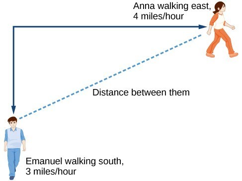
Anna and Emanuel start at the same intersection. Anna walks east at 4 miles per hour while Emanuel walks south at 3 miles per hour. They are communicating with a two-way radio that has a range of 2 miles. How long after they start walking will they fall out of radio contact?Answer: In essence, we can partially answer this question by saying they will fall out of radio contact when they are 2 miles apart, which leads us to ask a new question: "How long will it take them to be 2 miles apart?" In this problem, our changing quantities are time and position, but ultimately we need to know how long will it take for them to be 2 miles apart. We can see that time will be our input variable, so we’ll define our input and output variables.
- Input: t, time in hours.
- Output: [latex]A\left(t\right)[/latex], distance in miles, and [latex]E\left(t\right)[/latex], distance in miles
 Initial Value: They both start at the same intersection so when [latex]t=0[/latex], the distance traveled by each person should also be 0. Thus the initial value for each is 0.
Rate of Change: Anna is walking 4 miles per hour and Emanuel is walking 3 miles per hour, which are both rates of change. The slope for A is 4 and the slope for E is 3.
Using those values, we can write formulas for the distance each person has walked.
Initial Value: They both start at the same intersection so when [latex]t=0[/latex], the distance traveled by each person should also be 0. Thus the initial value for each is 0.
Rate of Change: Anna is walking 4 miles per hour and Emanuel is walking 3 miles per hour, which are both rates of change. The slope for A is 4 and the slope for E is 3.
Using those values, we can write formulas for the distance each person has walked.
[latex]\begin{array}{l}A\left(t\right)=4t\\ E\left(t\right)=3t\end{array}[/latex]
For this problem, the distances from the starting point are important. To notate these, we can define a coordinate system, identifying the "starting point" at the intersection where they both started. Then we can use the variable, A, which we introduced above, to represent Anna’s position, and define it to be a measurement from the starting point in the eastward direction. Likewise, can use the variable, E, to represent Emanuel’s position, measured from the starting point in the southward direction. Note that in defining the coordinate system, we specified both the starting point of the measurement and the direction of measure. We can then define a third variable, D, to be the measurement of the distance between Anna and Emanuel. Showing the variables on the diagram is often helpful. Recall that we need to know how long it takes for D, the distance between them, to equal 2 miles. Notice that for any given input t, the outputs A(t), E(t), and D(t) represent distances.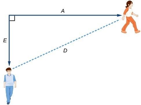 This picture shows us that we can use the Pythagorean Theorem because we have drawn a right angle.
Using the Pythagorean Theorem, we get:
This picture shows us that we can use the Pythagorean Theorem because we have drawn a right angle.
Using the Pythagorean Theorem, we get:
[latex]\begin{array}{l}D{\left(t\right)}^{2}=A{\left(t\right)}^{2}+E{\left(t\right)}^{2}\hfill & \hfill \\ ={\left(4t\right)}^{2}+{\left(3t\right)}^{2}\hfill & \hfill \\ =16{t}^{2}+9{t}^{2}\hfill & \hfill \\ =25{t}^{2}\hfill & \hfill \\ \text{ }D\left(t\right)=\pm \sqrt{25{t}^{2}}\hfill & \text{Solve for }D\left(t\right)\text{ using the square root}\hfill \\ =\pm 5|t|\hfill & \hfill \end{array}[/latex]
In this scenario we are considering only positive values of [latex]t[/latex], so our distance D(t) will always be positive. We can simplify this answer to D(t) = 5t. This means that the distance between Anna and Emanuel is also a linear function. Because D is a linear function, we can now answer the question of when the distance between them will reach 2 miles. We will set the output D(t) = 2 and solve for t.[latex]\begin{array}{l}D\left(t\right)=2\hfill \\ \text{ }5t=2\hfill \\ \text{ }t=\frac{2}{5}=0.4\hfill \end{array}[/latex]
They will fall out of radio contact in 0.4 hours, or 24 minutes.Q & A
Should I draw diagrams when given information based on a geometric shape? Yes. Sketch the figure and label the quantities and unknowns on the sketch.Example: Using a Diagram to Model Distance between Cities
There is a straight road leading from the town of Westborough to Agritown 30 miles east and 10 miles north. Partway down this road, it junctions with a second road, perpendicular to the first, leading to the town of Eastborough. If the town of Eastborough is located 20 miles directly east of the town of Westborough, how far is the road junction from Westborough?Answer:
It might help here to draw a picture of the situation. It would then be helpful to introduce a coordinate system. While we could place the origin anywhere, placing it at Westborough seems convenient. This puts Agritown at coordinates (30, 10), and Eastborough at (20, 0).
 Using this point along with the origin, we can find the slope of the line from Westborough to Agritown:
[latex]m=\frac{10 - 0}{30 - 0}=\frac{1}{3}[/latex]
The equation of the road from Westborough to Agritown would be[latex]W\left(x\right)=\frac{1}{3}x[/latex]
From this, we can determine the perpendicular road to Eastborough will have slope [latex]m=-3[/latex]. Because the town of Eastborough is at the point (20, 0), we can find the equation:[latex]\begin{array}{l}E\left(x\right)=-3x+b\hfill & \hfill \\ 0=-3\left(20\right)+b\hfill & \text{Substitute in (20, 0)}\hfill \\ b=60\hfill & \hfill \\ E\left(x\right)=-3x+60\hfill & \hfill \end{array}[/latex]
We can now find the coordinates of the junction of the roads by finding the intersection of these lines. Setting them equal,[latex]\begin{array}{l}\text{ }\frac{1}{3}x=-3x+60\hfill & \hfill \\ \frac{10}{3}x=60\hfill & \hfill \\ 10x=180\hfill & \hfill \\ \text{ }x=18\hfill & \text{Substituting this back into }W\left(x\right)\hfill \\ \text{ }y=W\left(18\right)\hfill & \hfill \\ \text{ }=\frac{1}{3}\left(18\right)\hfill & \hfill \\ \text{ }=6\hfill & \hfill \end{array}[/latex]
The roads intersect at the point (18, 6). Using the distance formula, we can now find the distance from Westborough to the junction.[latex]\begin{array}{l}\text{distance}=\sqrt{{\left({x}_{2}-{x}_{1}\right)}^{2}+{\left({y}_{2}-{y}_{1}\right)}^{2}}\hfill \\ \text{ }=\sqrt{{\left(18 - 0\right)}^{2}+{\left(6 - 0\right)}^{2}}\hfill \\ \text{ }\approx 18.974\text{ miles}\hfill \end{array}[/latex]
Analysis of the Solution
One nice use of linear models is to take advantage of the fact that the graphs of these functions are lines. This means real-world applications discussing maps need linear functions to model the distances between reference points.Try It
There is a straight road leading from the town of Timpson to Ashburn 60 miles east and 12 miles north. Partway down the road, it junctions with a second road, perpendicular to the first, leading to the town of Garrison. If the town of Garrison is located 22 miles directly east of the town of Timpson, how far is the road junction from Timpson?Answer: 21.15 miles
Fitting Linear Models to Data
A professor is attempting to identify trends among final exam scores. His class has a mixture of students, so he wonders if there is any relationship between age and final exam scores. One way for him to analyze the scores is by creating a diagram that relates the age of each student to the exam score received. In this section, we will examine one such diagram known as a scatter plot. A scatter plot is a graph of plotted points that may show a relationship between two sets of data. If the relationship is from a linear model, or a model that is nearly linear, the professor can draw conclusions using his knowledge of linear functions. Below is a sample scatter plot.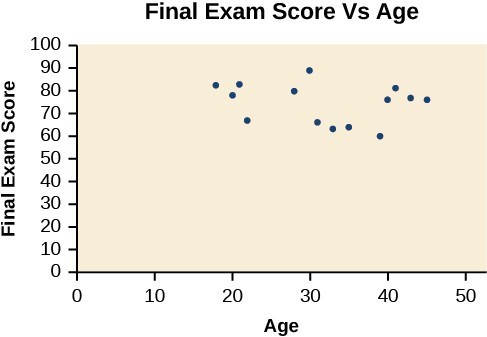 A scatter plot of age and final exam score variables
Example: Using a Scatter Plot to Investigate Cricket Chirps
The table below shows the number of cricket chirps in 15 seconds, for several different air temperatures, in degrees Fahrenheit.[footnote]Selected data from http://classic.globe.gov/fsl/scientistsblog/2007/10/. Retrieved Aug 3, 2010[/footnote] Plot this data, and determine whether the data appears to be linearly related.| Chirps | 44 | 35 | 20.4 | 33 | 31 | 35 | 18.5 | 37 | 26 |
| Temperature | 80.5 | 70.5 | 57 | 66 | 68 | 72 | 52 | 73.5 | 53 |
Answer:
Plotting this data suggests that there may be a trend. We can see from the trend in the data that the number of chirps increases as the temperature increases. The trend appears to be roughly linear, though certainly not perfectly so.
Find the line of best fit
One way to approximate our linear function is to sketch the line that seems to best fit the data. Then we can extend the line until we can verify the y-intercept. We can approximate the slope of the line by extending it until we can estimate the [latex]\frac{\text{rise}}{\text{run}}[/latex].Example: Finding a Line of Best Fit
Find a linear function that fits the data in the table below by "eyeballing" a line that seems to fit.| Chirps | 44 | 35 | 20.4 | 33 | 31 | 35 | 18.5 | 37 | 26 |
| Temperature | 80.5 | 70.5 | 57 | 66 | 68 | 72 | 52 | 73.5 | 53 |
Answer:
On a graph, we could try sketching a line.
Using the starting and ending points of our hand drawn line, points (0, 30) and (50, 90), this graph has a slope of [latex]m=\frac{60}{50}=1.2[/latex] and a y-intercept at 30. This gives an equation of [latex]T\left(c\right)=1.2c+30[/latex]
where c is the number of chirps in 15 seconds, and T(c) is the temperature in degrees Fahrenheit. The resulting equation is represented in the graph below.

Analysis of the Solution
This linear equation can then be used to approximate answers to various questions we might ask about the trend.Recognizing Interpolation or Extrapolation
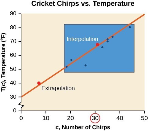
While the data for most examples does not fall perfectly on the line, the equation is our best guess as to how the relationship will behave outside of the values for which we have data. We use a process known as interpolation when we predict a value inside the domain and range of the data. The process of extrapolation is used when we predict a value outside the domain and range of the data. The graph below compares the two processes for the cricket-chirp data addressed in Example: Finding a Line of Best Fit. We can see that interpolation would occur if we used our model to predict temperature when the values for chirps are between 18.5 and 44. Extrapolation would occur if we used our model to predict temperature when the values for chirps are less than 18.5 or greater than 44. There is a difference between making predictions inside the domain and range of values for which we have data and outside that domain and range. Predicting a value outside of the domain and range has its limitations. When our model no longer applies after a certain point, it is sometimes called model breakdown. For example, predicting a cost function for a period of two years may involve examining the data where the input is the time in years and the output is the cost. But if we try to extrapolate a cost when [latex]x=50[/latex], that is in 50 years, the model would not apply because we could not account for factors fifty years in the future.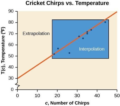 Interpolation occurs within the domain and range of the provided data whereas extrapolation occurs outside.
A General Note: Interpolation and Extrapolation
Different methods of making predictions are used to analyze data.- The method of interpolation involves predicting a value inside the domain and/or range of the data.
- The method of extrapolation involves predicting a value outside the domain and/or range of the data.
- Model breakdown occurs at the point when the model no longer applies.
Example: Understanding Interpolation and Extrapolation
| Chirps | 44 | 35 | 20.4 | 33 | 31 | 35 | 18.5 | 37 | 26 |
| Temperature | 80.5 | 70.5 | 57 | 66 | 68 | 72 | 52 | 73.5 | 53 |
- Would predicting the temperature when crickets are chirping 30 times in 15 seconds be interpolation or extrapolation? Make the prediction, and discuss whether it is reasonable.
- Would predicting the number of chirps crickets will make at 40 degrees be interpolation or extrapolation? Make the prediction, and discuss whether it is reasonable.
Answer:
- The number of chirps in the data provided varied from 18.5 to 44. A prediction at 30 chirps per 15 seconds is inside the domain of our data, so would be interpolation. Using our model: [latex-display]\begin{array}{l}T\left(30\right)=30+1.2\left(30\right)\hfill \\ \,\,\,\,\,\,\,\,\,\,\,\,\,\,\,\,\,\,=66\text{ degrees}\hfill \end{array}[/latex-display] Based on the data we have, this value seems reasonable.
- The temperature values varied from 52 to 80.5. Predicting the number of chirps at 40 degrees is extrapolation because 40 is outside the range of our data. Using our model: [latex]\begin{array}{l}40=30+1.2c\hfill \\ 10=1.2c\hfill \\ c\approx 8.33\hfill \end{array}[/latex]
Analysis of the Solution
Our model predicts the crickets would chirp 8.33 times in 15 seconds. While this might be possible, we have no reason to believe our model is valid outside the domain and range. In fact, generally crickets stop chirping altogether below around 50 degrees.Try It
According to the data from the table in Example 3, what temperature can we predict it is if we counted 20 chirps in 15 seconds?Answer: [latex-display]54^\circ \text{F}[/latex-display]
Finding the Line of Best Fit Using a Graphing Utility
While eyeballing a line works reasonably well, there are statistical techniques for fitting a line to data that minimize the differences between the line and data values.[footnote]Technically, the method minimizes the sum of the squared differences in the vertical direction between the line and the data values.[/footnote] One such technique is called least squares regression and can be computed by many graphing calculators, spreadsheet and statistical software. Least squares regression is also called linear regression, and we can use Desmos to perform linear regressions.Example: Finding a Least Squares Regression Line
Find the least squares regression line using the cricket-chirp data in the table below.| Chirps | 44 | 35 | 20.4 | 33 | 31 | 35 | 18.5 | 37 | 26 |
| Temperature | 80.5 | 70.5 | 57 | 66 | 68 | 72 | 52 | 73.5 | 53 |
Answer:
- Click the plus button (add item) in the upper left corner, and select table.
- Enter chirps data in the x1 column.
- Enter temperature data in the y1 column.
x1 44 35 20.4 33 31 35 18.5 37 26 y1 80.5 70.5 57 66 68 72 52 73.5 53 - If you can't see the points on the grid, use the plus and minus buttons in the upper right hand corner to zoom in or out on the grid, or click on the wrench and change the upper bound of x1 to 60, and 100 for the y1.
- In the empty cell below the table you created, enter the expression y1~mx1+b
- You can add labels to your graph by clicking on the wrench in the upper right hand corner, and typing them into the cells that say "add a label"
Analysis of the Solution
Notice that this line is quite similar to the equation we "eyeballed" but should fit the data better. Notice also that using this equation would change our prediction for the temperature when hearing 30 chirps in 15 seconds from 66 degrees to:[latex]\begin{array}{l}T\left(30\right)=30.281+1.143\left(30\right)\hfill \\ \text{ }=64.571\hfill \\ \text{ }\approx 64.6\text{ degrees}\hfill \end{array}[/latex]
Q & A
Will there ever be a case where two different lines will serve as the best fit for the data? No. There is only one best fit line.Distinguish Between Linear and Nonlinear Relations
As we saw in Example: Finding a Line of Best Fit with the cricket-chirp model, some data exhibit strong linear trends, but other data, like the final exam scores plotted by age, are clearly nonlinear. Most calculators and computer software can also provide us with the correlation coefficient, which is a measure of how closely the line fits the data. Many graphing calculators require the user to turn a "diagnostic on" selection to find the correlation coefficient, which mathematicians label as r. The correlation coefficient provides an easy way to get an idea of how close to a line the data falls. We should compute the correlation coefficient only for data that follows a linear pattern or to determine the degree to which a data set is linear. If the data exhibits a nonlinear pattern, the correlation coefficient for a linear regression is meaningless. To get a sense for the relationship between the value of r and the graph of the data, the image below shows some large data sets with their correlation coefficients. Remember, for all plots, the horizontal axis shows the input and the vertical axis shows the output.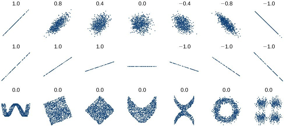 Plotted data and related correlation coefficients. (credit: "DenisBoigelot," Wikimedia Commons)
A General Note: Correlation Coefficient
The correlation coefficient is a value, r, between –1 and 1.- r > 0 suggests a positive (increasing) relationship
- r < 0 suggests a negative (decreasing) relationship
- The closer the value is to 0, the more scattered the data.
- The closer the value is to 1 or –1, the less scattered the data is.
Example: Finding a Correlation Coefficient
Calculate the correlation coefficient for cricket-chirp data in the table below.| Chirps | 44 | 35 | 20.4 | 33 | 31 | 35 | 18.5 | 37 | 26 |
| Temperature | 80.5 | 70.5 | 57 | 66 | 68 | 72 | 52 | 73.5 | 53 |
Answer: Desmos provides you with the correlation coefficient when you use it to calculate a linear regression. The correlation coefficients is labeled as r = 0.951 for this dataset. This value is very close to 1, which suggests a strong increasing linear relationship. https://www.desmos.com/calculator/ruvzg6iy3o
Use a Linear Model to Make Predictions
Once we determine that a set of data is linear using the correlation coefficient, we can use the regression line to make predictions. As we learned previously, a regression line is a line that is closest to the data in the scatter plot, which means that only one such line is a best fit for the data.Example: Using a Regression Line to Make Predictions
Gasoline consumption in the United States has been steadily increasing. Consumption data from 1994 to 2004 is shown in the table below.[footnote]http://www.bts.gov/publications/national_transportation_statistics/2005/html/table_04_10.html[/footnote] Determine whether the trend is linear, and if so, find a model for the data. Use the model to predict the consumption in 2008.Is this an interpolation or an extrapolation?| Year | '94 | '95 | '96 | '97 | '98 | '99 | '00 | '01 | '02 | '03 | '04 |
| Consumption (billions of gallons) | 113 | 116 | 118 | 119 | 123 | 125 | 126 | 128 | 131 | 133 | 136 |
Answer:
![]() We can introduce new input variable, t, representing years since 1994, this makes entering the data into Desmos easier.
Read the value for b, and the value for the slope, m, from Desmos to create the equation for the regression line:
We can introduce new input variable, t, representing years since 1994, this makes entering the data into Desmos easier.
Read the value for b, and the value for the slope, m, from Desmos to create the equation for the regression line:
[latex]C\left(t\right)=113.318+2.209t[/latex]
The correlation coefficient was calculated to be 0.997, suggesting a very strong increasing linear trend. Using this to predict consumption in 2008, which is 14 years after 1994, [latex]\left(t=14\right)[/latex],[latex]\begin{array}{l}C\left(14\right)=113.318+2.209\left(14\right)\hfill \\ =144.244\hfill \end{array}[/latex]
The model predicts 144.244 billion gallons of gasoline consumption in 2008. This is an extrapolation because there is not a datapoint whose x1 value is 2008. The scatter plot of the data, including the least squares regression line, is shown below in Desmos. Note how we changed the viewing window for the y-axis to 100 < y < 150. https://www.desmos.com/calculator/lv27pmtdbhTry It
Use Desmos to find a linear regression for the following data, which represents the amount of time a SCUBA diver can spend underwater as a function of the depth of the water.| Depth (feet) | Time (minutes) |
| 50 | 80 |
| 60 | 55 |
| 70 | 45 |
| 80 | 35 |
| 90 | 25 |
| 100 | 22 |
Answer: Here is a sample Desmos graph for this dataset. https://www.desmos.com/calculator/zyrpta1uls 1) The equation for the regression line is [latex]y=-1.1143x+127.24[/latex] 2) A diver can spend [latex]y=-1.1143(110)+127.24=1.51[/latex] minutes at a depth of 110 feet. 3) A diver can spend [latex]y=-1.1143(120)+127.24=-6.48[/latex] minutes at a depth of 120 feet. This doesn't make sense because a negative value for time doesn't have any meaning. 4) To find at what depth the dive time would be zero, we need to set the regression equation equal to zero. [latex-display]\begin{array}{l}0=-1.1143x+127.24\\-127.24=-1.1143x\\114.19 = x\end{array}[/latex-display] A diver at a depth of 114.19 would have a dive time of 0 minutes.
try it
Here are more data sets that you can plot in Desmos. Try to find a linear regression for them, then by looking at the correlation coefficient you can determine whether they are linear.| Depth of the Columbia River | Water Velocity |
| 0.66 | 1.55 |
| 1.98 | 1.11 |
| 2.64 | 1.42 |
| 3.3 | 1.39 |
| 4.62 | 1.39 |
| 5.94 | 1.14 |
| 7.26 | 0.91 |
| 8.58 | 0.59 |
| 9.9 | 0.59 |
| 10.56 | 0.41 |
| 11.22 | 0.22 |
| % of Mississippi River in Crops (By Basin) | Nitrate Concentration (mg/ L) |
| 2.4 | 0.647 |
| 1.3 | 1.062 |
| 14.3 | 1.432 |
| 0.5 | 0.579 |
| 45.6 | 3.561 |
| 46.6 | 3.938 |
| 1.5 | 0.927 |
| 53.6 | 2.549 |
| 4.1 | 0.357 |
| 3.1 | 0.245 |
Dimensions of the Lava Dome in Mt. St. Helens, t = 0 on 18 October 1980 (eruption was 18 May).
| (days) | (millions of cubic meters) |
| 0 | 2.9 |
| 70 | 13 |
| 109 | 28 |
| 173 | 40 |
| 242 | 56 |
| 322 | 64 |
| 376 | 75 |
| 547 | 88 |
| 603 | 100 |
| 699 | 115 |
| 872 | 152 |
| 922 | 154 |
| 1087 | 173 |
| 1343 | 178 |
| 1692 | 212 |
| 1858 | 243 |
FYI
Divers who want or need to descend to depths greater than 100 feet employ different techniques and equipment to help them safely navigate the depth. For example, different gas mixtures or rebreather equipment may be used. Gas mixtures such as Oxygen, Helium, and Nitrogen can help to mitigate the narcotic effects of breathing gas at great depths.[footnote]https://en.wikipedia.org/wiki/Trimix_(breathing_gas)[/footnote] Scuba diver using rebreather with open circuit bailout cylinders returning from a 600-foot (180 m) dive
Key Concepts
- Scatter plots show the relationship between two sets of data.
- Scatter plots may represent linear or non-linear models.
- The line of best fit may be estimated or calculated, using a calculator or statistical software.
- Interpolation can be used to predict values inside the domain and range of the data, whereas extrapolation can be used to predict values outside the domain and range of the data.
- The correlation coefficient, r, indicates the degree of linear relationship between data.
- A regression line best fits the data.
- The least squares regression line is found by minimizing the squares of the distances of points from a line passing through the data and may be used to make predictions regarding either of the variables.
Glossary
- correlation coefficient
- a value, r, between –1 and 1 that indicates the degree of linear correlation of variables, or how closely a regression line fits a data set.
- extrapolation
- predicting a value outside the domain and range of the data
- interpolation
- predicting a value inside the domain and range of the data
- least squares regression
- a statistical technique for fitting a line to data in a way that minimizes the differences between the line and data values
- model breakdown
- when a model no longer applies after a certain point
Licenses & Attributions
CC licensed content, Original
- Revision and Adaptation. Provided by: Lumen Learning License: CC BY: Attribution.
- Temperature as a Function of the Number of Cricket Chirps in a 15 Second Period Interactive. Authored by: Lumen Learning. Located at: https://www.desmos.com/calculator/ruvzg6iy3o. License: Public Domain: No Known Copyright.
- Consumption of Gas as a Function of Year Interactive. Authored by: Lumen Learning. Located at: https://www.desmos.com/calculator/lv27pmtdbh. License: Public Domain: No Known Copyright.
- Dive Time as a Function of Depth Interactive. Authored by: Lumen Learning. Located at: https://www.desmos.com/calculator/zyrpta1uls. License: Public Domain: No Known Copyright.
CC licensed content, Shared previously
- College Algebra. Provided by: OpenStax Authored by: Abramson, Jay et al.. Located at: https://openstax.org/books/college-algebra/pages/1-introduction-to-prerequisites. License: CC BY: Attribution. License terms: Download for free at http://cnx.org/contents/[email protected].
- Precalculus. Provided by: OpenStax Authored by: Jay Abramson, et al.. License: CC BY: Attribution. License terms: Download For Free at : http://cnx.org/contents/[email protected]..
- Question ID 1425. Authored by: unknown, mb Lippman, David. License: CC BY: Attribution. License terms: IMathAS Community License CC-BY + GPL.
- Question ID 3483. Authored by: Triplett, Shawn, mb Lippman, David. License: CC BY: Attribution. License terms: IMathAS Community License CC-BY + GPL.
- Question ID 49643. Authored by: Parsons, Marc, mb Sousa, James. License: CC BY: Attribution. License terms: IMathAS Community License CC-BY + GPL.
- Scuba diver using rebreather with open circuit bailout cylinders returning from a 600-foot (180 m) dive. Authored by: Trevor Jackson. Located at: https://commons.wikimedia.org/w/index.php?curid=25988843. License: CC BY-SA: Attribution-ShareAlike.
